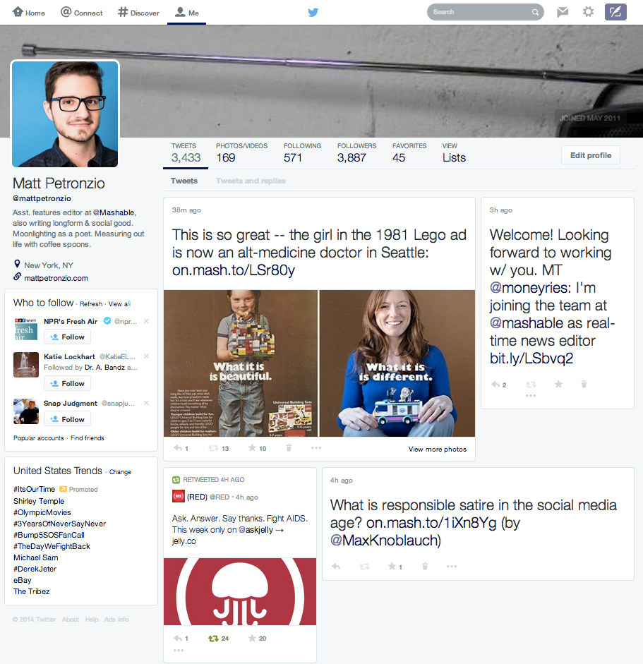

It hasn’t even been a month since Twitter’s last update to its desktop look and feel rolled out to all 241 million users and there’s already screenshots of a complete redesign currently being tested. One of the lucky recipients of the new look profile, Mashable’s assistant features editor, Matt Petronzio who immediately took a screenshot which was published yesterday.
As you can see in the picture below, the new profile borrows heavily from Facebook’s profile picture and banner combination but retains the ‘Who to follow’ and ‘Trending’ sections down the left hand side. The banner image has also increased in size to 1500×500 pixels from the current 1252×626. Underneath the banner is a new ‘Photos/Videos’ section which joins the usual, Tweets, Following, Followers, Favourites and Lists. Petronzio noted that anyone else’s Twitter profile viewed from his account with the new design are automatically converted to the new look design for him.
The timeline has changed from a linear RSS type feed to a more masonry style design (different size squares, like building blocks) which is similar to the layout of both Pinterest and Google+ and even the initial design of htxt.africa. The experimental design focuses heavily on multimedia with photos and videos becoming prominent in each block. It should provide Twitter with more places to insert ads which could help it drive revenue and satisfy its needy investors.
Design changes from Facebook and Twitter are usually met with polarised opinions from users who, more often than not, take to the social media site in question to vent frustration. What do you think of the new design? Let us know in the comments below.