
Remember when Cell C hired Trevor Noah as its CEO?
Of course, it was a joke used to announce a new brand identity and CEO was an acronym for “customer experience officer”. That stunt took place eight years ago.
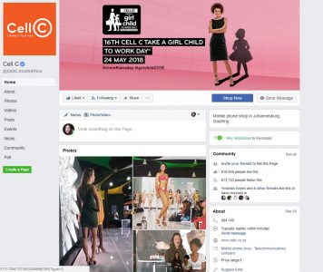
We bring this up because earlier this week we noticed that the logo over on the firm’s Facebook page had changed.
Being the curious cats we are we contacted Cell C to find out what was happening. Had the page been hacked? Had the page been captured by nefarious state actors?
Truthfully, none of those.
“Following the recapitalisation transaction, Cell C has started to evolve its strategic focus and its overall image as a brand. As a part of this, it has started to evolve its brand identity,” Cell C told htxt.africa about the sudden shift in brand identity.
The recapitalisation transaction mentioned refers to the recapitalisation of Cell C shares after Blue Label Telecoms acquired 45 percent of its shares.
This brand evolution began as early as last year when the network began introducing orange and purple colouring in its existing brand identity.
“As an unowned colour, orange is a vibrant, fresh and an exciting colour that will assist Cell C to stand out from the crowd. It represents the newly invigorated Cell C culture and shows the energy that we bring to our products and services,” the firm said.
The old payoff line – The Power Is In Your Hands – will also be retired in favour of the new line – Connect Your Way – which was introduced last year.
Cell C tells us that it will continue to roll out the new brand identity over the next few months, so don’t get a shock when things start looking a bit different.

