A new year means a new look, at least for Luno and those precious few clawing at their New Year’s resolutions.
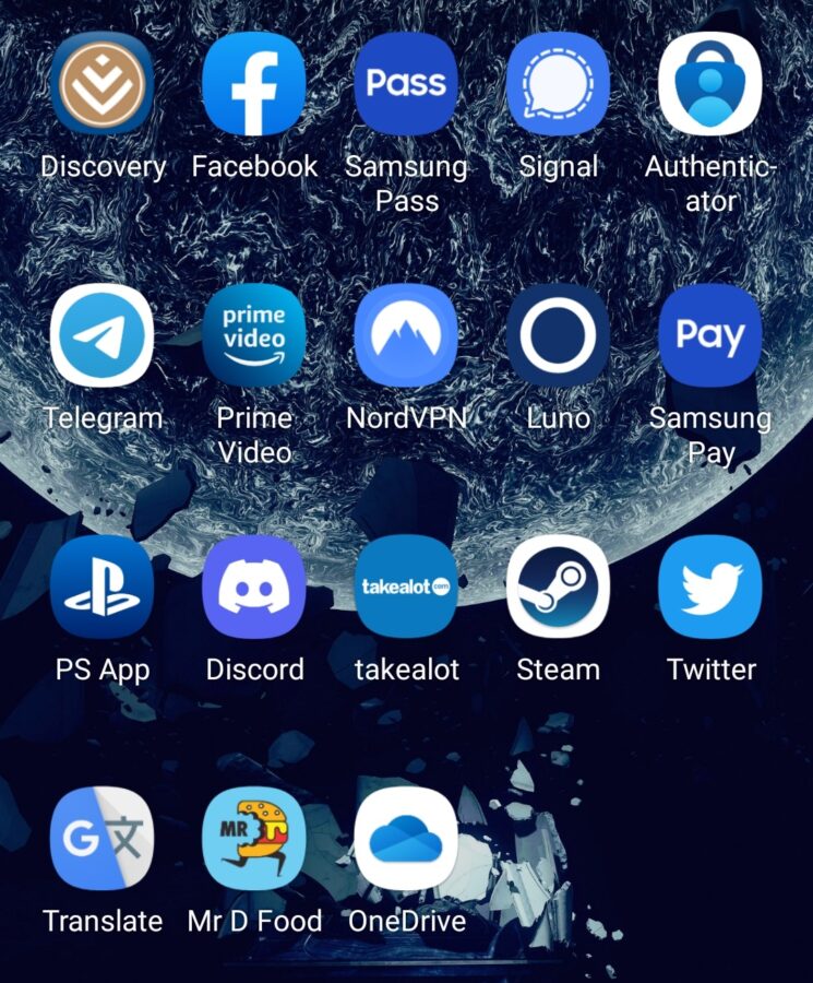
As of today Luno has a new look and that means you might be struggling to find your app if you’re a long time user. To be frank not all that much has changed. The O now features drop shadows in a blue gradient and the blue it rests on is slightly brighter.
This new logo can be seen in the header image above and Luno will be updating its social media throughout the week to reflect the change.
“As the excitement around crypto keeps growing, we’d like it to be very clear that Luno is a simple investment platform for everyone. That’s why you’ll no longer see the space theme in our illustrations that feel closer to everyday life. You’ll also notice some new, brighter colours, but nothing else will change in the app, which you can continue to use just as before,” Luno explained in a blog post.
We understand the thinking here. Discord recently underwent a similar rebranding in a bid to shift away from its reputation as a platform expressly for gamers. While we loved the space theme Luno had, we’re exactly the sort of person Luno doesn’t need to join its platform, because we’re already on it.
Importantly, Luno’s branding will only take effect once you’ve updated your application. This process started on Monday and will continue rolling out through to 24th January.
When the company first launched it was known as BitX, but in 2017 the firm rebranded to Luno. Since then the brand identity has shifted ever so slightly.
As the brand mentions, nothing has changed as regards functionality of the platform. Users are still able to access their wallets and cryptocurrency albeit with a new lick of paint.
Truth be told, we really hope this Luno rebrand helps the app stand out a bit more although given how popular blue is for app icon colouring, we aren’t convinced it will. Please app developers, we know you’re using colour theory here, there really has to be a better colour than blue.


