
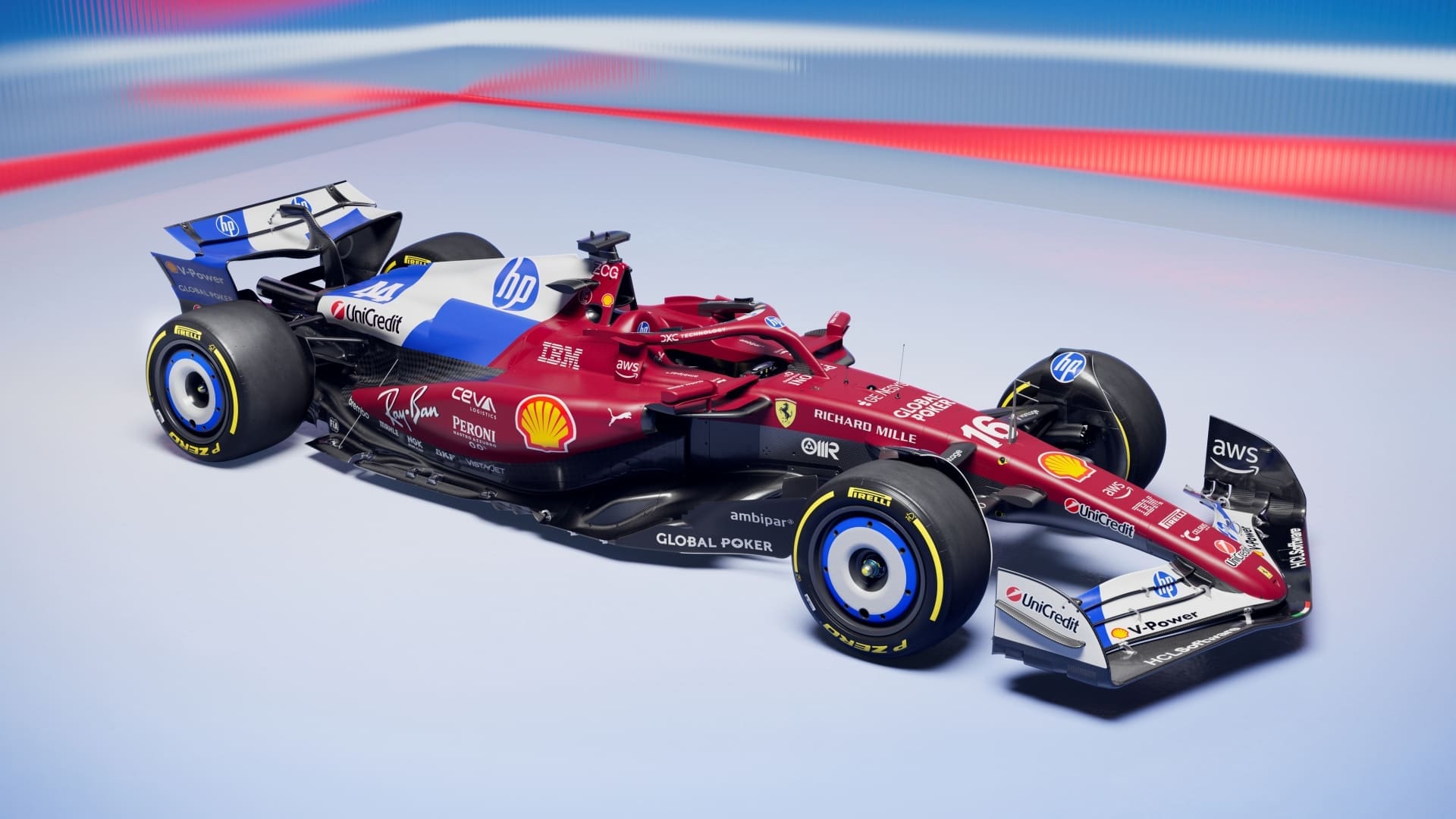
- Scuderia Ferrari HP revealed a once off livery for the Crypto.com Miami Grand Prix this weekend.
- The livery features HP’s branding and colour scheme prominently on the rear half of the car and fans aren’t happy with the look.
- HP and Ferrari collaborated on the material used to make the livery possible and it’s said to be 14 percent lighter than it was last year.
Last year, HP joined Ferrari as a title sponsor, adding its name to the team name which is now Scuderia Ferrari HP. While big technology companies sponsoring an F1 team isn’t new, the presence of HP has become a pox upon the Maranello-based team.
At least, that’s the opinion of fans who have reacted with disgust to the reveal of the team’s new livery for this weekend’s Crypto.com Miami Grand Prix in Miami.
A new look for Miami! 🔵⚪️ pic.twitter.com/K1KCwaRrw2
— Scuderia Ferrari HP (@ScuderiaFerrari) April 30, 2025
Ferrari says in a news release that the new livery marked the first year of the pair’s partnership. Interestingly, the livery was also a chance for HP to try some new technologies.
“Engineering teams from both Ferrari in Maranello and HP in Barcelona worked hand in hand and experimented with technologies and materials to achieve the final result. Innovative techniques were used to produce the film that covers part of the SF-25. These represent a significant step forward over the technology used last year, creating a car wrap that is up to 14% lighter and up to 17% thinner, with increased thermal resistance. The film is PVC-free, fully recyclable, and applied using HP’s latest generation of latex technology,” Ferrari wrote.
“Formula 1 is constantly evolving, and both companies will continue to refine wrap technologies together — making them even more efficient, enabling bolder aesthetics and design innovation while reducing the time required to apply the film,” it added.
This is good news for fans who have long lamented the reliance on exposed carbon fibre (yes even Ferrari) by teams looking to shed every gram they can in search of cutting thousandths of seconds off of lap times. If wraps are lighter, that could lead to more colourful cars.
Is that a good thing though?
Almost as soon as the new look was revealed, the mocking began. One of the more popular statements made by fans was that Ferrari had run out of red ink. Others said that this was perhaps the ugliest livery ever conceived by an F1 team and we’re struggling to think of one more deserving of that title.
Who dis this 😆 pic.twitter.com/7JWFudd3hO
— ರವಿ ಕೀರ್ತಿ ಗೌಡ (@ravikeerthi22) April 30, 2025
“How does the PRINTER COMPANY not understand good visual design?” a Redditor on r/Formula1 asked in response to the livery reveal.
The big question many have regarding the growing influence HP has on the team’s look can be answered with one word – money.
As a title sponsor, HP has a lot more influence than say, Shell or Santander has over how its branding is placed on the car. The exact amount HP pays for that privilege isn’t public knowledge but when the partnership was announced last year, Will Buxton speculated that the deal was worth two-thirds of the seasonal cost-cap for F1 teams or, around $90 million a year. For context, Oracle’s title sponsorship of Red Bull Racing is said to be worth $300 million over a five-year period.
With that in mind, it’s little wonder why Scuderia Ferrari places the HP logo so prominently everywhere it can. If we were being given $90 million a year we’d also put aesthetics to the side.
What we find bizarre is that Ferrari is clinging to the red colour when it could, quite easily, adopt a blue and white colourway as it did in the early days of F1. Many fans agree that this would be a great move, even as a once-off special livery. Hell, if Racing Bulls can turn its car pink for a race, Ferrari can omit the red just once. The team is already doing it for the weekend’s race suits so why not just go the whole hog?
Some will be quick to point out that if Ferrari did adopt blue and white, that may cause confusion with the Williams team, even though these days that car is more blue than it is blue and white.
But, we can’t rest the blame for this optical audacity purely at the feet of Ferrari, HP needs to take some blame as well.
The company that was established as Hewlett Packard in 1939, back when garages were the office space of startups, hasn’t changed its logo all that much over the decades. In fact, aside from dropping the full name and iterating on the blue colouring, the HP logo actually hasn’t changed at all. Seriously, just scroll through the Wikipedia page to see that really, HP’s logo has always been a lowercase H alongside a lowercase P with a splash of blue.
HP has a monochrome logo that would look fine on the Ferrari but we suspect it isn’t used because that would mean the HP logo is filled with red, something that likely goes against HP’s corporate identity rules.
Unfortunately, HP’s presence and heavy-handed approach to its branding, no matter how light they claim it is, isn’t winning Ferrari any fans or races for that matter. The team currently ranks fourth in the 2025 Constructor’s Championship and while both Sir Lewis Hamilton and Charles LeClerc have stood on the podium this year, the team is just inconsistent even between practice sessions, qualifying and the race.
The Crypto.com Miami Grand Prix takes place on Sunday at 22:00 South African time if you want to watch the blue, white, red, yellow and black streak wind its way through a track that takes place in what is effectively, a parking lot.

